Smart Watch UI Design (2014)
UX | UI
Background & Challenges
The year 2014 holds particular significance for this project — it was one year before Apple revolutionized wearables with the Apple Watch. As a designer, couldn't resist imagining how people would interact with such a new device format.
A smartwatch presents unique constraints: it sits on the wrist, limiting interaction to one hand, and features a screen dramatically smaller than smartphones. This means traditional mobile interactions simply won't translate. But before addressing these specific challenges, a fundamental question emerged: what core functionality should this new wearable device prioritize? The limited screen real estate demands careful curation.
Everything started with a subtle flowing wisp of light — a gentle point flowing with a soft tail:
Whisper Light
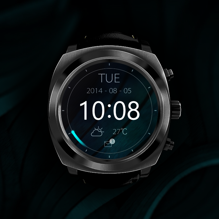
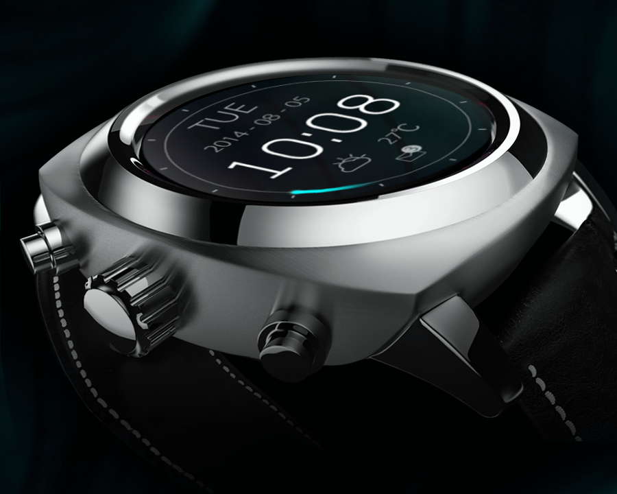
▲ Home screen
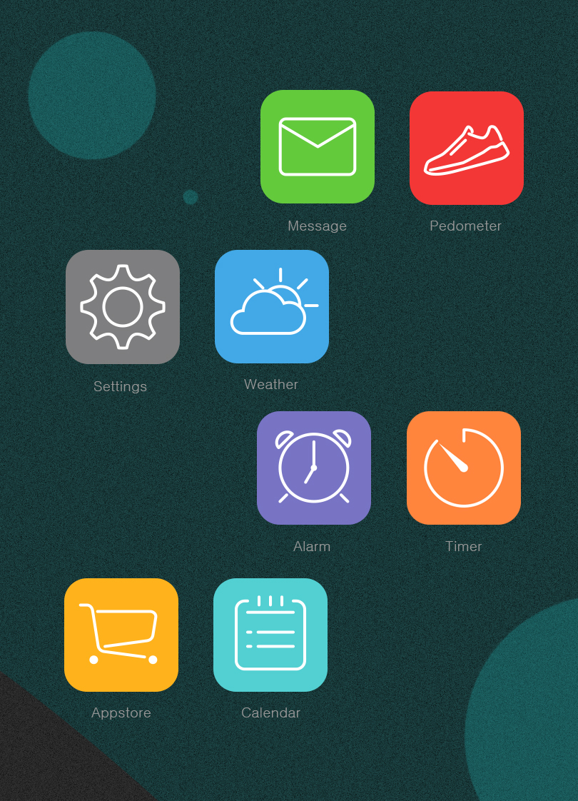
The home screen prioritizes hierarchy and functionality. Time occupies the center position with maximum visual emphasis, ensuring readability at a glance. Date and weather information appear with secondary prominence, while only critical notifications—new messages and incoming calls—claim dedicated positions on the home screen.
The second hand takes the form of a moving light dot with a trailing tail, embodying the theme of perpetual motion that defines time itself. This element serves as the visual manifestation of the 'Whisper Light' design theme, creating cohesion throughout the interface.
The dark background optimizes battery performance on OLED displays, which is crucial for a small wearable device.
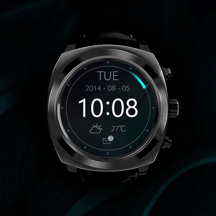
▲ Motion design for home screen and app drawer
▲ Native app icons
▲ App drawer
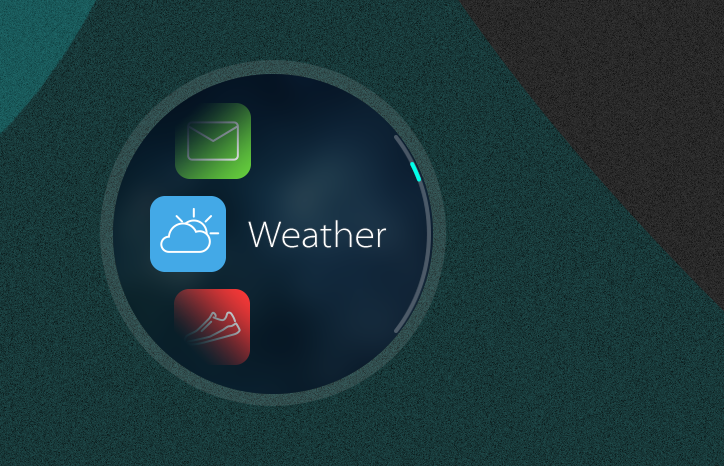
The compact app drawer interface accommodates the small screen by showing three icons at once. Only the center one displays its app title to ensure readability, while fading effects on the top and bottom row suggest scrollable content in both directions.
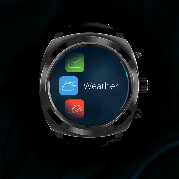
▲ Interaction from app drawer to weather app
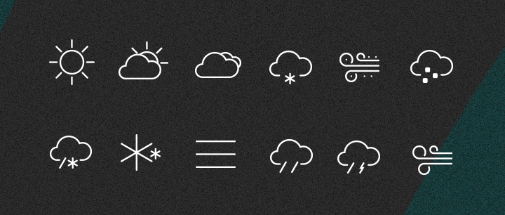
▲ Weather icons
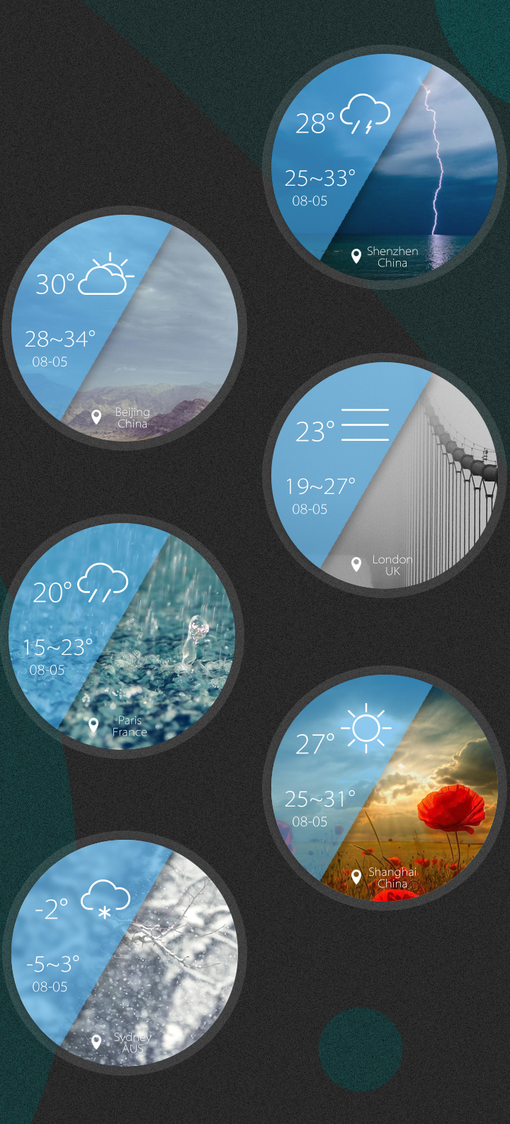
▲ Weather app
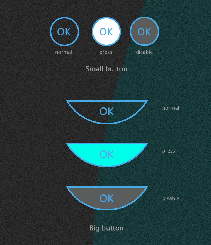
▲ Buttons