UX Design for perceptual research
UX design | UI design | Coding
Challenge: Combatting data noise in crowdsourcing
We conduct online perceptual experiments using art to understand human visual perception. While crowdsourcing allows us to expand our research and keep moving forward during the pandemic, gathering reliable data from participants around the world can be tricky. Distractions or boredom might affect the quality of their responses, and hurt data quality. I identified that the primary friction point wasn't the science itself, but the unintuitive interfaces that failed to sustain participant engagement over long trial sessions.
Strategy: Interaction as a scientific tool
My goal was to transform dry, repetitive tasks into a seamless, "flow-state" experience. I designed and coded custom interactive systems using HTML, CSS, and JavaScript to achieve three objectives:
- Reduce cognitive load: Simplified complex psychology tasks into rapid, single-input interactions (keyboard-only or mouse-only).
- Eliminate perceptual bias: Engineered UI behaviors, auto-hiding high-contrast outlines during rating, to ensure the interface didn't interfere with the participant's visual judgment.
- Optimize for velocity: Streamlined the operation and confirmation phases to keep participants focused on the stimuli rather than the navigation.
I also optimized the data recording format on the back end for efficient analysis later on.
1. Triplet Comparison
Triplet comparison task is a robust method commonly used in psychology research. Participants are shown three items and asked to identify which two are most similar. In my research group, for example, we might present 3 paintings and ask for the most similar pair in terms of depiction style.
Requirements
- Essential:
- Present 3 images side by side.
- Interaction to select 2 images, then proceed to the next trial.
- Nice to have:
- To be able to put any pair together for easy comparison.
- Ensure an intuitive and smooth operation to maintain participant engagement, minimize fatigue and boredom, for better data quality.
Solution (keyboard-only interaction)
- The animation serves as visual help for participants to understand the task better, and possibly increase engagement.
- Group two selected images with a gray rectangle for easy comparison.
- One key to toggle the order/selection, another key to both confirm and proceed to the next trial. Fast and Smooth.
- Only need two keys that are closely positioned for rapid, smooth one-hand operation.
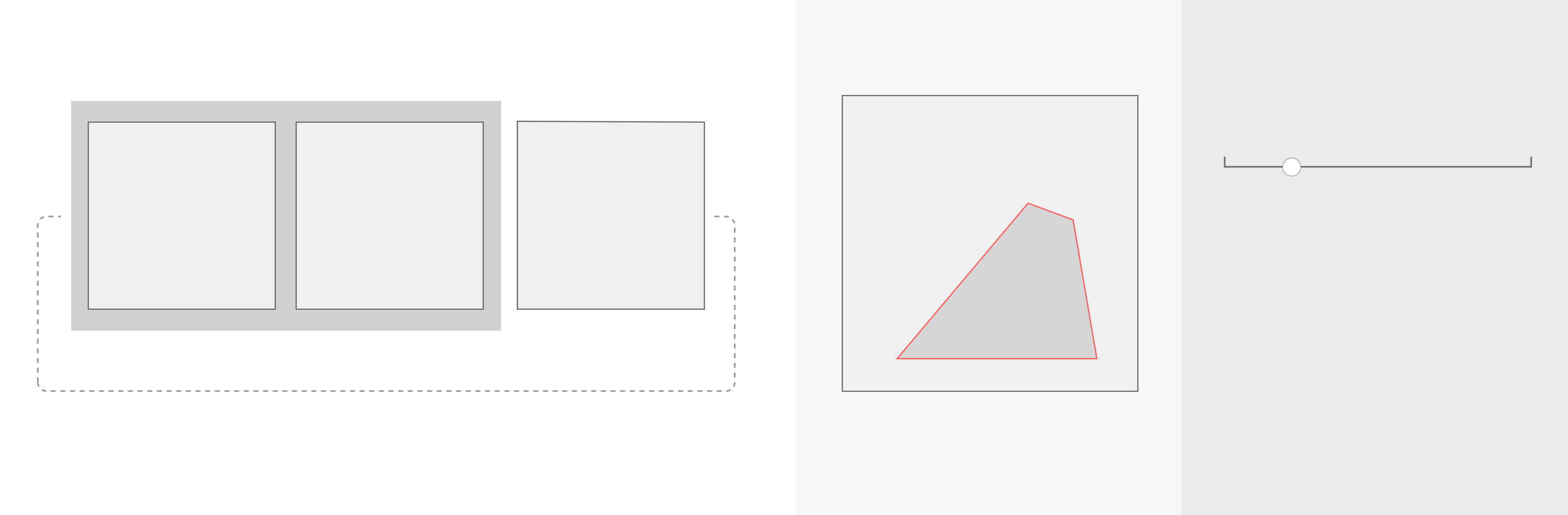
2. Attributes rating of image segment highlighted by red outlines
An attribute rating task involves participants rating certain attributes on a scale to gauge perceptions. It sometimes uses a 7-point or 5-point scale for straightforward, categorical responses, or a continuous scale for more nuanced, precise feedback. This method is essential in research and market studies for understanding public preferences and perception. In my research group, for example, we might ask participants to rate attributes such as convincingness for a selection with an image.
Requirements
- Essential:
- Present 1 image and a rating scale at the same time.
- Part of the image is highlighted to indicate the target area for rating.
- Interaction to easily rate on a continuous scale, then proceed to the next trial.
- Nice to have:
- Provide an option to show and hide the outline. A vibrant color is necessary to mark the selection clearly, but may influence perceptual judgement due to its intensity.
- Ensure an intuitive and smooth operation to maintain participant engagement, minimize fatigue and boredom, for better data quality.
Solution (mouse-only interaction)
- Contextual overlays & Bias reduction: When the cursor is on the image area (left side), the red outline shows. Click is disabled to prevent accidental rating. When the cursor is on the rating scale side, it controls the rating scale. And the outline disappears to minimize its potential influence on participants' perceptual judgement, reducing experimental bias through UI design.
- Low cognitive load: When rating on the right side, only the horizontal position of the cursor matters. Low precision requirements makes the operation easier. Click to both confirm and proceed to the next trial.
- No compromise on speed: The red outline flashes twice at the start of every trial, regardless of the cursor position. This allows participants to keep their cursor on the rating side for maximum speed without losing track of the target.
Impact: Better UX, better science
In summary, simple intuitive tasks, streamlined interaction, and a reasonable overall duration helped maintain engagement and minimize boredom. Applying UX and HCI principles led to higher quality data and ultimately better science.
Below are some comments we received from participants:
``It was interesting to do. I enjoyed it.''
``The study was extremely well made and well thought. outlines were amazingly done. All in all, a really interactive and interesting study.''
These 2 experiment systems I designed and coded are modular frameworks, allowing easy adoption by other researchers by swapping stimuli and attributes without rewriting the interaction logic. And indeed they were later adopted and appreciated by other researchers.