Zooming in on style: exploring style perception using details of paintings
Visual perception research
Background & challenges
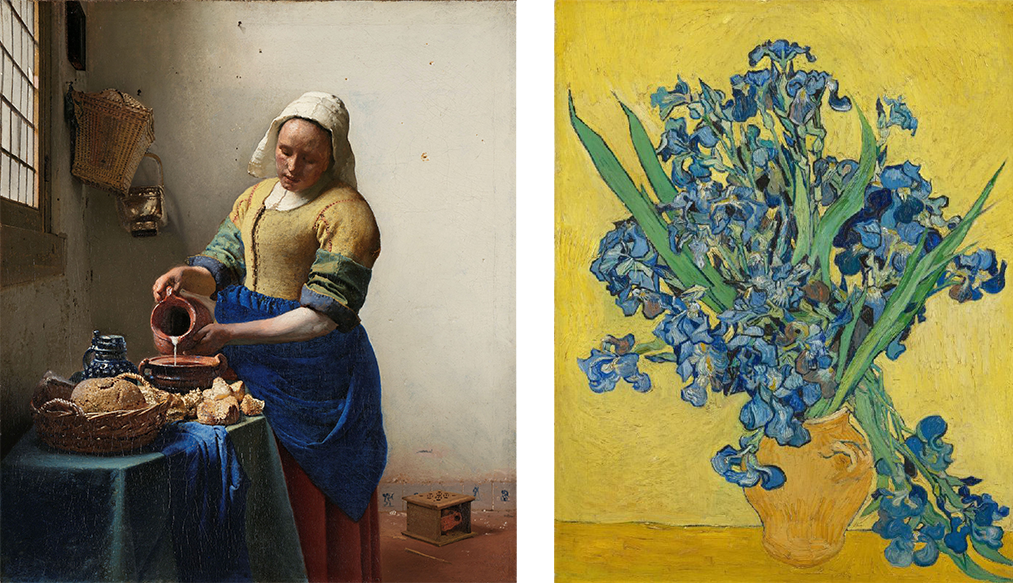
As someone who loves painting, photography, and visual art in general, I am always curious about visual styles. What is style? What defines a style? It seems to be a high-level, abstract, and implicit concept. When I tried to find answers in literature, I found that the number of scientific studies on this topic is quite limited. I thought maybe one of the reasons is it's difficult to isolate style from confounding factors. For example, medium (e.g., oil painting, engraving) and content (e.g., landscape, portrait) can both affect style perception. If I ask you to judge the style difference between the two paintings below, one showing a human figure, the other illustrating flowers in a vase, could you purely focus on the style differences without getting distracted by content difference? However, content difference is not an easy variable to rule out, since content is determined by the artists from the very beginning. The difficulty of content control increases even more when we want to have a diverse selection of paintings covering various styles, regions and periods. How can we tackle this problem that seems impossible to solve?
Contribution 1: Control of subject matter
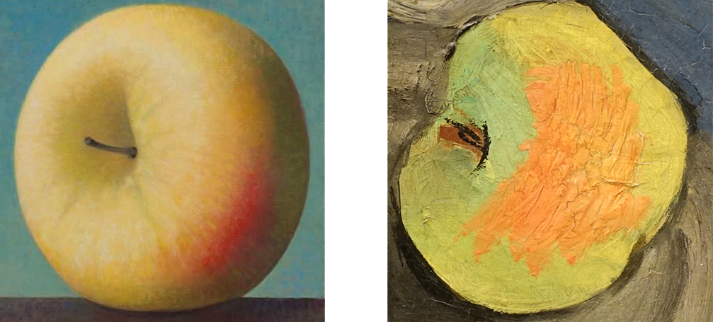
We found a solution by focusing on a `timeless' object, apple. In other words, instead of using whole paintings, we only crop the fragments depicting apples. But why apples you might ask? Apple is timeless because it can be found in the hand of Adam from a pre-renaissance era, or on the kitchen table from 17th century Dutch still life paintings, or even from surreal paintings from Magritte.
Contribution 2: Levels of information
Previous theories suggest that one needs specific knowledge about the artist, period, and art movement to recognize certain styles. By using cropped apples from the whole paintings as the target, we not only get content (subject matter) well controlled, we also removes information about period, region, etc., so we can test whether high-level background knowledge is necessary to perceive depiction styles.
Contribution 3: Methodology
Multidimensional Scaling (MDS) is the standard method to explore an
unknown perceptual space. In order to combine data from different
participants, we chose the triplet task over similarity rating (see the
animation below). Participants are presented with three images, they are
asked to select which pair is most similar in style. Compared to
similarity rating where data are on a continuous scale that can vary
among people, triplet task results data in a `binary' fashion. The
answer is one of three possible pairs, which made combining data across
participants straight forward. However, the nature of triplet setup and
large amount of stimuli resulted huge amount of required trials, which
is not really feasible.
To reduce the number of required trials, we used a novel method,
Landmark MDS (LMDS) (De Silva & Tenenbaum, 2004) from the computer
domain. It was originally designed to reduce computing pressure by using
a portion of the distance matrix. We took one step further by only
collecting the necessary portion of the distance matrix. More details
can be found in the LMDS section of
our paper.
To answer the question of what is visual (depiction) style, we conducted 2 experiments: Experiment 1 tries to find the perceptual space of style, Experiment 2 tries to understand the dimensions of the perceptual space.
Experiment 1: Finding the perceptual space
From similarity judgements, we know the perceptual distances between each pair of images. With the distances, we can construct a multi-dimensional perceptual space.
Method
Stimuli: 48 square cut-outs of depicted apples from 42 oil
paintings. Both the origin and creation year of the oil paintings cover
a wide rage.
Participants: 415 online participants recruited from Amazon
Mechanical Turk (AMT)
Procedure: participants are asked to judge which two of the
apples are more similar in terms of style.
Results
It resulted a 3D perceptual space of style. To view its structure better from different angles, we designed this 3D data visualization, so that the corresponding images can be seen from all angles. To understand the possible meaning of the dimensions, we conducted Experiment 2.
Experiment 2: Understanding the space
In order to understand the perceptual space of style, we used 3 types of data:
- We collected subjective human ratings on attributes such as glossiness and smoothness for all the 48 apple cut-outs, then fitted the attribute vectors into the perceptual space;
- We measured color information such as hue and chroma, then fitted the color measurements into the perceptual space;
- We fitted the meta data, creation year, into the perceptual space.
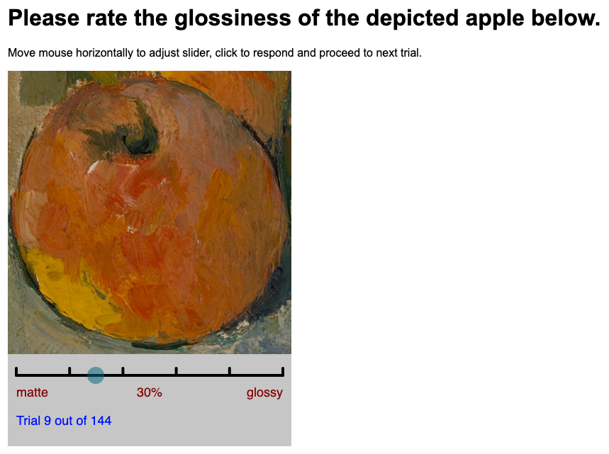
Method - Attributes rating
Stimuli: the same 48 images of apple cut-outs as Experiment 1.
Participants: 224 online participants recruited from AMT
Procedure: participants are asked to rate certain attribute of
the apple images.
Method - Color measurements
We first created a circular mask to remove the background and make sure we only measure the colors of the apples. Then we measured hue, chroma and brightness of the average color.
Findings
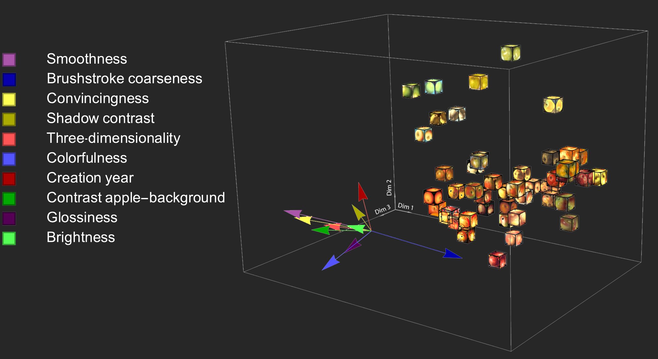
The averaged property ratings are fitted into the 3D perceptual space of style. The longer arrow indicates a better fit. As we can see, the first dimension correlates well with smoothness and brushstroke coarseness, pointing to the opposite directions. Interestingly, the coarse brushstroke on the medium (canvas) might transferred to the depicted object (apple skin). For example, an apple in impressionism style with coarse brushstroke made the apple to be perceived as rough. Besides these two attributes, the first dimension also correlates well with convincingness, which is less about texture, more about overall perception. The smoother the apple skin, the more convincing it's perceived.
The second dimension correlates well with creation year, which I will explain in more detail later.
The third dimension correlates with colorfulness. To better understand the relationship between the style perceptual space and color information, we measured color statistics as the following figure shows:
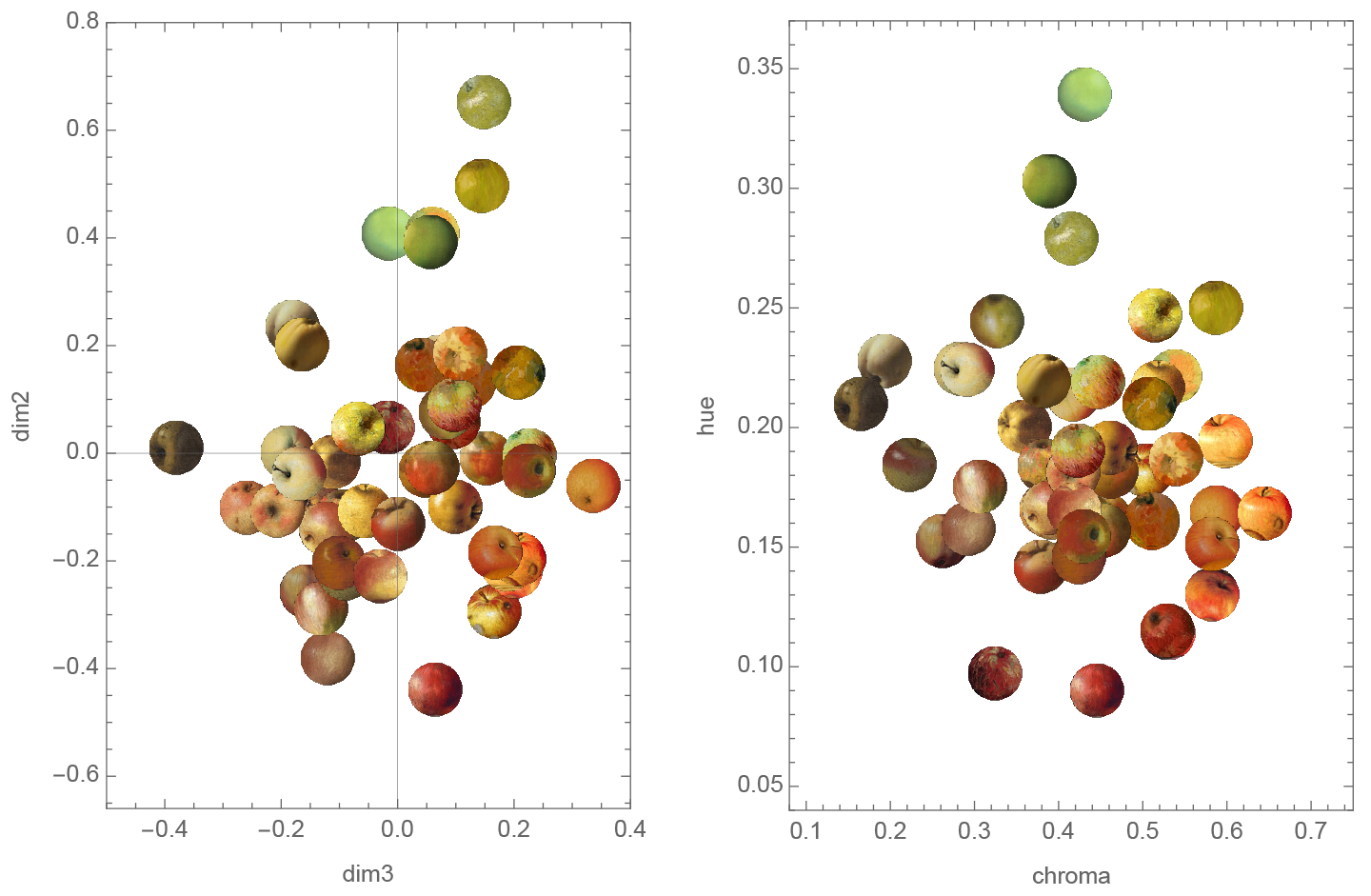
On the left side, you can see a 2D projection of the 3D style space, showing the second and third dimensions. On the right side is the same apples in the color space. Their coordinates are determined by the measured hue and chroma information. The two spaces are not only similar visually, they also show high correlations.
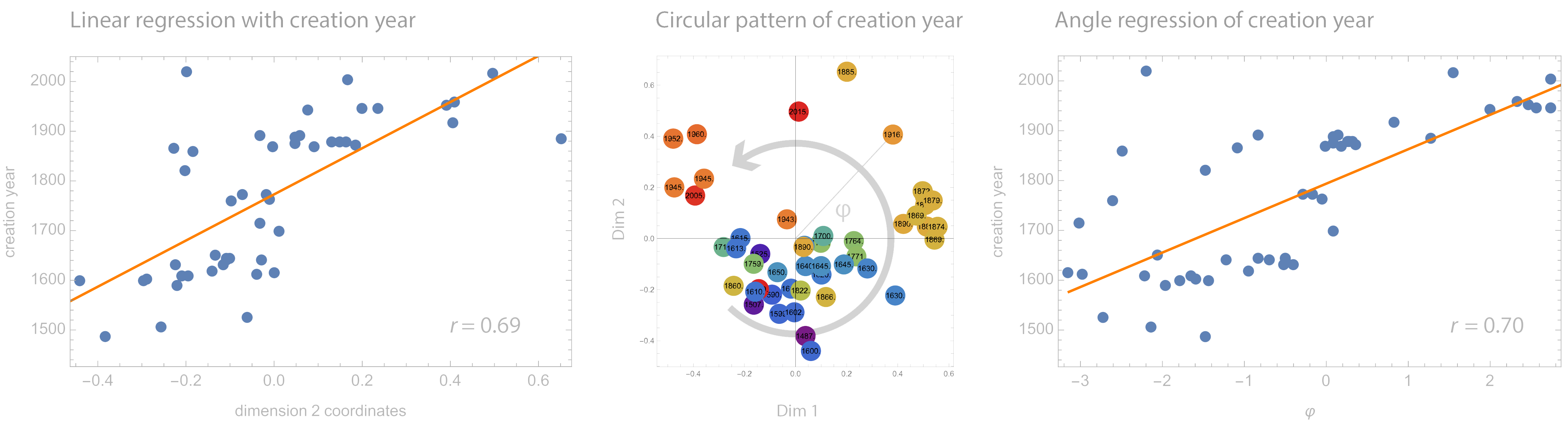
Now let's come back to this mysterious correlation with creation year. The left plot shows a high linear correlation between Dimension 2 in the style space and creation year. This `time-dimension' is surprising because: 1) we cropped the painting to show only one single object, all the elements that might contain period-related information were removed; 2) the original task was selecting the most similar pair in terms of style, not about creation time at all; 3) the majority participants probably have minimal or zero art training.
We later color coded all the stimuli with creation year, then we noticed a circular pattern from the first two dimensions, more pronounced than the linear pattern along the second dimension. So we calculated the circular correlation, and find a better fit. Interestingly, another study (Elgammal, Liu, Kim, Elhoseiny, & Mazzone, 2018) with very different stimuli and method (using neural networks instead of human judgment data) also found a circular pattern of creation year. Both findings indicate that a cyclical pattern might be present in the history of European art during the last six centuries. This cyclical pattern is in line with the pattern of fashion, even history itself: like a spiral line, repetitive while moving forward.
Key takeaways:
- People might use texture cues (smoothness - roughness), color (hue and chroma) and convincingness to judge depiction styles.
- People might not need professional art-related knowledge to perceive different styles.
- The structure of art history is hidden even in fragments of paintings.