Material perception across different media: a comparison between oil paintings and engravings
Visual perception research
Background & challenges
In a previous study, we investigated the perception of visual style within one medium, oil painting. Actually, besides personal style (e.g., the style of Van Gogh) and period style (e.g., the style of Baroque), the medium itself can also influence the final appearance. For example, oil painting and water color have distinct overall styles.
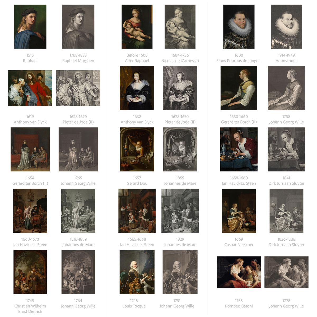
The comparison between 2 or more media have rarely been studied. We assume one of the reason is that different content play as a confounding factor. As the figure below shows, when content are dramatically different, one can hardly focus purely on medium difference. And artists already chose their familiar medium first, then made decision on the content, it is hardly a variable that can be controlled for existing art.
Nevertheless, we found a solution by comparing oil paintings and their engraved reproductions. Before the invention of photography, engraving was used as a reproduction method in addition to being a standalone form of art. The identical content and very different medium gave us a perfect opportunity. As can be seen from the image above, oil painting has all kinds of vivid colors and smooth gradient. Engraving, on the other hand, has only black ink and white paper. The vastly different 2 media are similar as modern HDR TV vs. e-ink Kindle screen.
Stimuli
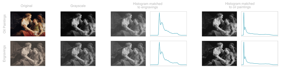
Besides the original version, we also created 3 manipulations to understand the influence of color and contrast. The first manipulation removed color from the images. The other two manipulations matched the overall histogram (overall luminance distribution) to either painting or engraving.
Procedure
From the 15 pairs, we selected 88 areas with various materials and asked participants to rate certain attributes.
- 5 categories of material selections: skin, fabric, lace, fur, wood, ceramic, metal
- 5 attributes: three-dimensionality, glossiness, smoothness, softness, convincingness
I designed and programmed the interface for the online experiments. The image shows on the left side, with the red outline indicating the focused area to rate. On the right side, participants can rate on the continuous scale using the mouse. For each trial, the red outline will first flash twice regardless of the mouse position, then it only shows when the mouse is on the left image area. When a participant moves the mouse to the right side, the horizontal position of the mouse controls the rating scale, regardless of the vertical position. A left click will confirm the current rating and automatically proceed to the next image. This article explains the design in more details.
Results
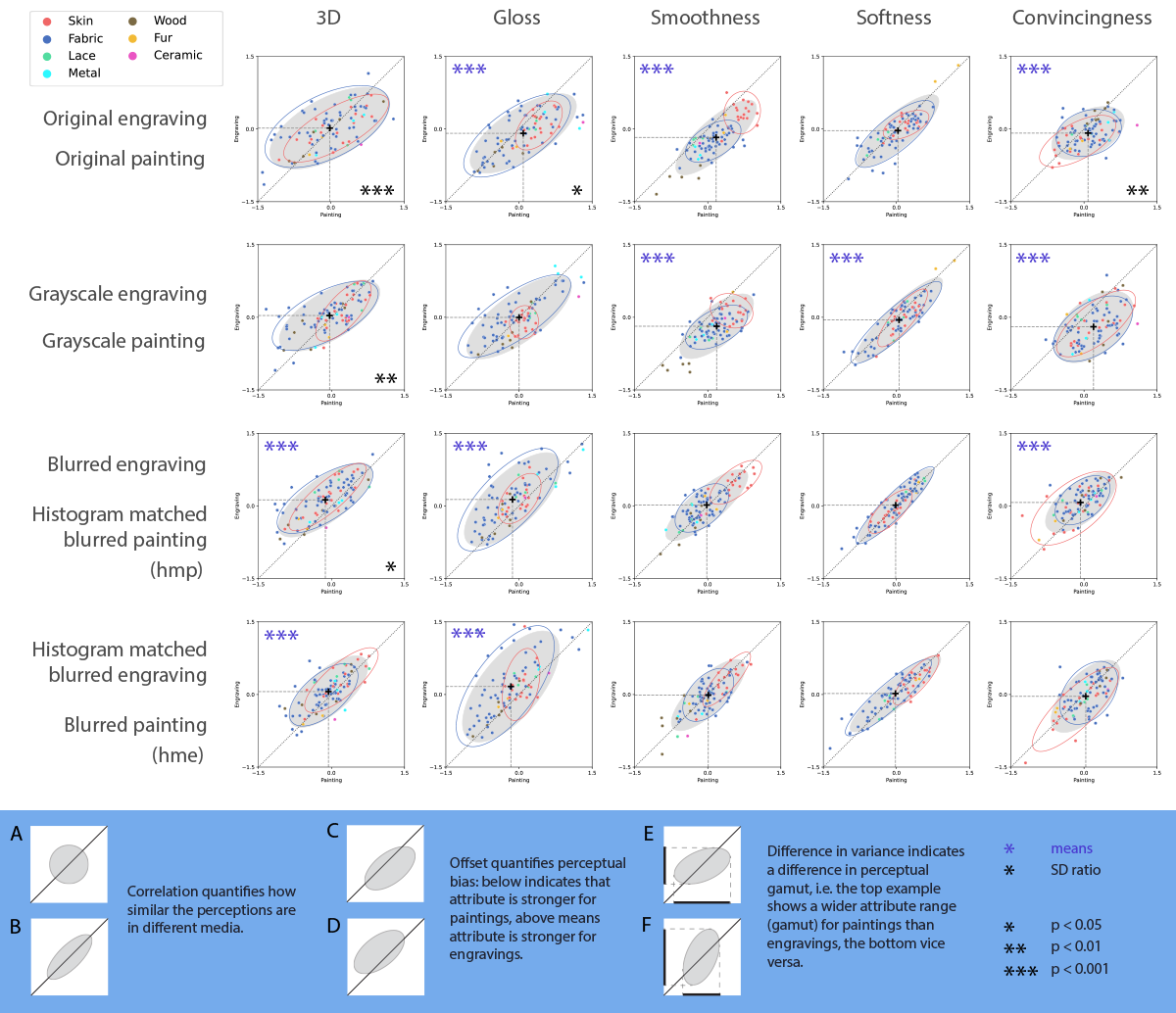
Results overview. Each subplot is an experimental session. Row one to row four represent original, greyscale and two histogram-matched conditions, respectively. Each data point in these scatter plots represents the mean rating of engravings as a function of the mean rating of oil paintings of the same material selection. Each data point is colour-coded with respect to a material category, as indicated in the legend on the top left corner. The ellipses are confidence ellipses from bivariate normal distributions kept constant at 1.96 standard deviation. The grey ellipses are based on all data, the blue and red ellipses denote fabric and skin, the two largest material categories. The legend on the bottom with the blue background illustrates a few possible scenarios. Purple asterisks on the top left corner in a given subplot indicate that the mean ratings for oil paintings and engravings were significantly different for that session. Black asterisks on the bottom right corner of a given subplot indicate that the standard deviations for oil paintings and engravings were significantly different from each other for that session.
Key takeaways:
- All 20 sessions show high positive correlations between engravings and oil paintings. It suggests engravings are able to render the materials similarly well, although being a limited medium with only black lines and white paper.
- We do find differences between the 2 media, oil paintings usually show broader range of these attributes.
- Color does not play an important role in material perception from our results, but (local) contrast does.